
Photo by Lukas Blazek on Unsplash
When you think of data visualization, you most likely are going to picture charts or infographics with colorful, bright data. You may also think that it is a somewhat new phenomenon. Both assumptions are incorrect. I know, I had the same ones.
The foundations of data visualization can be seen prior to the 1600s through celestial charts and tracking of planetary movements. While this may seem like it's not much, any type of data recording and visual representation of that data counts. As exploration became prevalent in the 1700s, the newest type of data was expressed through cartography and the use of geometric shapes in charts. The 1800s showed significant growth in the field with the formation of graphs (bar, pie, etc.) and line plots. Advanced theories and the use of color and other artistic techniques helped the rapid growth. The beginning of the 1900s endured a "dark age" of sorts where the development of data visualization slowed significantly, only to pick back up in the 1950s and continue to the trajectory that we are at today.
Of course, the natural progression of society always involves advancements in technology. With each milestone in society and new information discovered about our world, there is a need to share this information. It's one thing to collect raw data, but something completely different to share the knowledge in a digestible way. However, this need helps push the envelope on creativity.
Also, there is always a new set of data that we have never discovered before if it weren't for technological advancements. For example, we are now able to geo-track data and populate digital maps thanks to satellites and intricate software. And of course, new data means new ways to visualize it.

Source: Microsoft Power BI
These advancements, however, do come with a price. Given how technology is developing rapidly, there is a constant stream of data, almost unlimited. There is so much out there that it can be completely overwhelming to not only interpret but to formulate what the data is actually telling you. There is such a thing as too much data.
With such a large amount of information, it is easy for it to be misconstrued especially given rampant misinformation on the internet. The need for instant knowledge, in conjunction with the automatic trust of the audience, can be a recipe for disaster. The creator of the visual could purposefully be using a misleading graph in order to sway public opinion. Or, they could make an artistic mistake that inadvertently changes the meaning of the information.
So in that case, what makes a "good chart"? Well, considering the behavior of the general population/society (immediate results to fit a busy lifestyle and short attention span), a chart needs to be clear and concise. Someone has to be able to look at it and understand it within a few seconds, which also means it needs to be well-designed.
For the most part, the interpretation of data should be done by the designer and the results are what's visually represented. Everything should be labeled and legible so the audience is not left figuring out what the numbers mean.
I personally love a chart or visual that I can instantly understand the main idea, without even reading some of the finer print. The graphic below is a good depiction of this. I know automatically that the bigger circles represent larger populations, and that they are grouped by continent through the use of color and outlines. There's no other text that gets in the way with enough white space and complimentary colors that make it easy on the eyes.

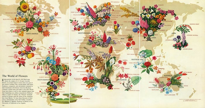
Another example of a "good chart" is this map of where certain flowers originated. This is great because despite there being over 110 flowers, it does not look messy or confusing. All of the information is right there, so there isn't a need for scrolling back up to remember column headings or labels.
I love a good interactive chart or infograph, and one that I really like is "The World Through the Eyes of the US." It's long and utilizes hovering over icons to reveal more information. However, just the sheer visual of the country flags can provide a pretty clear picture. This is one of those that I wouldn't mind sitting for a while and playing around with it.
So, what do you think makes a "good chart"?
References:
A Brief History of Data Visualization
Information is Beautiful
The World of Flowers
コメント