If I didn’t think visual design was hard last week, I sure do think so now.
As I continue on my journey of learning the ins and outs of visual design, I began to delve deeper into the more complex concepts of composition. No longer was I looking at the lines, points, and shapes of a piece, but rather how they relate to each other and their position on the plane. What makes great art extraordinary is how an artist can create spatial depth to force a certain perspective. The most popular example of this concept is making images appear three-dimensional on a two-dimensional plane. You can commonly see this in street art in major cities, like the one below.
The Crevasse by Edgar Mueller
Reading about the fundamentals of composition reminded me of my trip to Germany and Hungary about a year and a half ago (pre-pandemic, the good ol’ days). I visited a 3D art museum in Budapest where you could interact with the paintings for some really quirky photos. I was so impressed by how realistic the paintings looked that I still think about them today. And now, I understand why they are so impressive.
I decided to take one of the photos I took at the museum as a base for a composition that involved other photos from that trip, paying special attention to the concepts. I’ll show you what I came up with first and then get into the nitty-gritty of the design.

From left to right in the foreground: Betty, myself, and Dana
Symmetrical vs. Asymmetrical
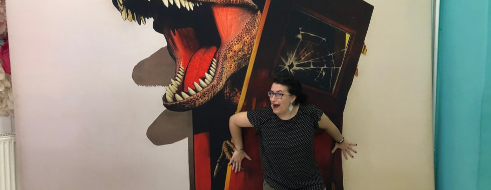
This is definitely an asymmetrical piece, as what is on the left is not mirrored on the right (or vice versa). If I desired, I could have made it symmetrical by mirroring the dinosaur busting through the door to the left.
Despite it being asymmetrical, it is balanced. The visual weight is evenly distributed because there are objects on both sides of the piece, so it seems “in harmony.” Things would appear off if there were only the dinosaur, myself, and Dana as it would appear “heavy” on the right.
Spatial Depth
The dinosaur breaking through the door was the photo that I started with. It’s a perfect example of the 3D effect but unfortunately, I can’t claim it as my own. One of the big reasons it appears 3D is from the lighting and shadows. The light is angled off-center to the right (just a bit), which creates the shadow of its head and teeth, while also defining the darkness behind the door.
Since Betty is the closest to the dinosaur’s head, and therefore the light, I needed to continue using shadows. This was difficult for me because I was nit-picky about the exact angle the light was coming from. I still don’t think I got it right, but I think it’s close. I placed the brightest spot in the background where the dinosaur head’s shadow is to enhance where the light is coming from. The whole image does not have the same intensity of light; it’s almost like a spotlight is shining just at the dinosaur’s head.
Foreground, Middle Ground, Background
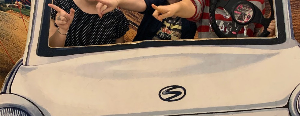
The dinosaur, my friends, and I serve as the foreground of the piece. Generally, objects in the foreground appear the biggest and sharpest of the whole piece to give the viewer the illusion that they are closer to them. The road and car are smaller and a bit fuzzy, indicating that it’s farther away. This imitates how our brains and eye perceive the world around us.
Overlapping and Layering
Because the mirror tiles act as the background, I had to make sure everyone else was layered on top, especially Betty.
To add Dana holding the door, I had to make her slightly taller so it could look like she is holding back the top of the door. She also needed to be layered on top of me because it wouldn’t make sense if I was holding her and the door back.
The car and road are pretty straightforward. The most difficult part about it was positioning it in a way that would appear as if the road is curving into the composition. It’s still not how I want it but the concept is there.
Contrast
One of the reasons I choose the mirrored tiles as my background is because overall it is monotone. Having a busy background would deter the effectiveness of the 3D and make it hard to distinguish what was what.
Typography
This I could have done much better with, but it was difficult because the photos for those were skewed and distorted. I had to continuously transform the images until I could get them to be someone readable and also have the correct angle.
One thing I would change, as I’m just now noticing, is the license plate of the car. I would have flipped it so it would not read mirrored.
“Many small people who in many small places do many small things that can alter the face of the world.” (you know, like letting out a dinosaur?)
For the curious minds out there, here are the photos I used for this piece:


P.S.: There’s an Easter egg in my finished piece… can you find it?
References:
Hardt, Michael. Design Definition. PowerPoint.
Landa, Robin. Graphic Design Solutions. Boston, MA, Cengage, 2019.
Comments