
One of the maps I created early on in my geography days for a project related to the 2004 Indian Ocean Tsunami.
A good data set can be the foundation for a great story. An excellent data set can be the foundation for many stories. There’s a lot to be told through data in not only charts and graphs, but maps as well. This is the visualization I love the most. My minor in college was geography, and I took several GIS (Geographic Information Systems) courses where I made my own maps from public data. It’s where I learned that I love cartography and that I have an utter hatred for the Mercator projection.
There are many variations of maps that can be created to tell any story you wish, but there are some more popular than others:
Choropleth- maps used for data sets that are comparing areas (counties, states, countries, etc). The most common example of this type of map is a US Election map. There is a colored scale, sometimes a gradient, to distinguish the range of numbers
Symbol- maps that have proportional circles (or another icon), where the bigger the circle, the higher or more of the value there is. The smaller the circle, the lower or less value. These also utilize a colored scale.
Locator- maps that use markers to indicate where something is in relation to an area. The most recognizable of these are the maps you get when entering an amusement park, or a mall map that indicates “you are here.”
Following up on my last blog post, I took the three data sets that I cleaned up and transformed them into each of the maps described.
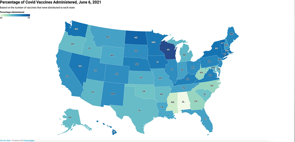
Map Type: Choropleth Data Set: https://data.cdc.gov/Vaccinations/COVID-19-Vaccinations-in-the-United-States-Jurisdi/unsk-b7fc Map URL: https://datawrapper.dwcdn.net/5S6mV/1/
There’s a lot of data in this set that I cleaned up in order to make it more succinct and focused. However, it was hard to pick just one column to use. I wanted to somehow show the differences in the three vaccines by having the numbers show up when hovering over a state. I also wanted to show the percentage of each age group that has received the vaccine. Both of these will lead to more complex visualizations, so I had to refocus on showing something more simplistic.
Early on in the dash for vaccination, there was a lot of news about how some states did not administer all the vaccines that were distributed to them, causing some severe loss during a crucial time. I wanted to revisit that number now that we seem to be on the “better” end of the pandemic.
To take this further, I could grab the population of each state, separate it into age groups, and find the percentage of each group who is vaccinated. There could be one map for each age range, and the maps could be grouped together.
This map, for some reason, gave me the most trouble, to the point where I had to close my laptop and walk away. DataWrapper wasn’t recognizing the two columns, instead combining them into one. It took me the longest time to realize that it was throwing a temper tantrum over one blank cell. Oh, technology…

Map Type: Symbol Data Set: https://www.radiotimes.com/tv/entertainment/eurovision-song-contest-2021-results-scores-newsupdate/ Map URL: https://datawrapper.dwcdn.net/0PQs2/2/
Considering I can’t get many of the Eurovision songs out of my head, this map and data set is a must for me. Out of the three, this one seemed the most obvious to me in terms of what type I should use and what piece of data to highlight. The most important thing about Eurovision is the points, so of course I had to showcase the range of points, with the biggest and darkest circle being the winner. Hovering over the dot tells you the country name, and indicates the final score in the “Total Points” scale at the top left.
I could take this data further using this same map type by plotting the number of Spotify plays. I could find how many times each country has won since the beginning of the contest (Ireland has won the most, by the way).
It’s…in the Mercator projection….
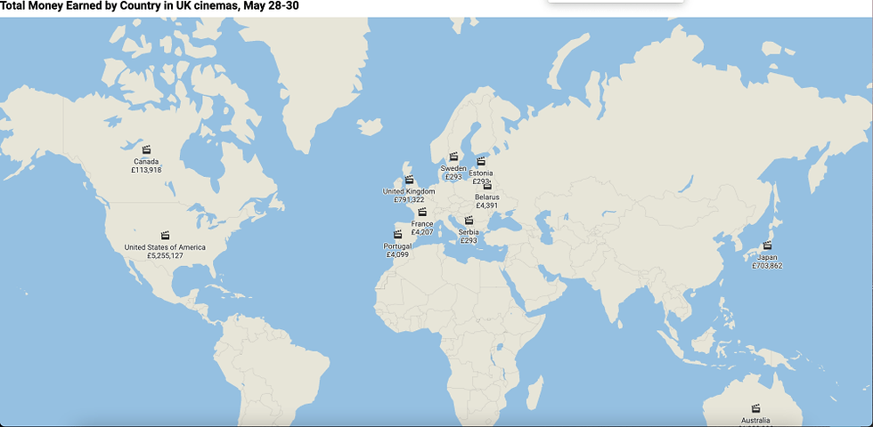
Map Type: Locator Data Set: https://www.bfi.org.uk/industry-data-insights/weekend-box-office-figures Map URL: https://datawrapper.dwcdn.net/j9O4Q/2/
The locator map was a little difficult for me to wrap my head around. I normally associate locator maps in conjunction with something that provides context, like a news article that’s describing the best restaurants in town. To me, just having the country wasn’t enough, and also didn’t provide enough information for the reader. That’s when I decided to add the total money earned by the country. However, many of the films had countries team up. To get an amount for each country, and in a way that would not skew the data, I divided the money earned by the number of countries that produced the film. It’s not necessarily accurate, because one country could be getting a higher percentage of the profit, but it’s enough to compare.
It would be really cool if I could somehow get the address of every cinema in the UK involved in this data, along with a breakdown of the earnings per film. I don’t know if something like that exists, but it would be cool to see if a certain region of the UK is watching indie films versus mainstream ones.
References:
Cairo, A. (2016). The truthful art: Data, charts, and maps for communication.
Monmonier, M. S. (1996). How to lie with maps.
Commentaires